Dishes & Palates
Overview
Dishes & Palates is a top-tier food brand offering a wide range of tasty, affordable value meals with exceptional customer service across Nigeria. This case study highlights the development of a comprehensive brand identity and visual system designed to support the company's nationwide expansion and establish a strong, recognizable presence in Nigeria's competitive food delivery market.
My contribution
Brand Strategy & Positioning Brand Identity Development Visual System Design Brand Guidelines
The team
1 × Founder 1 × Brand Strategist 2 x Product designer 2 x Visual designer
Year
2023-2024
Process
Project Overview
Challenge
How do you create a distinctive brand identity for a food delivery service that communicates quality, affordability, and reliability while standing out in Nigeria's crowded food tech market?
Objectives
- Develop a memorable brand identity that resonates with Nigerian consumers across demographics
- Create a comprehensive visual system applicable across all brand touchpoints (mobile app, packaging, signage, marketing materials)
- Establish brand standards that support multi-location operations and national expansion
- Position the brand to compete effectively against established food delivery platforms
Research & Discovery
Understanding the Market
To create a brand that would resonate with Nigerian consumers, we conducted comprehensive research:
- Competitive analysis: Examined positioning and visual identity of existing food delivery services and restaurant brands
- Consumer insights: Identified what Nigerian customers value most in food brands—taste, affordability, speed, and trust
- Cultural context: Explored how colour, typography, and visual elements could reflect local tastes while maintaining modern appeal
Key Insight: Nigerian consumers wanted a food brand that felt premium yet accessible—offering quality meals without the premium price tag.
Brand Strategy & Positioning
Defining the Brand Personality
We positioned Dishes & Palates as:
- Quality-focused: Delivering consistently tasty meals that customers can rely on
- Accessible: Offering value without compromising on taste or service
- Trustworthy: Building confidence through transparency and excellent customer service
- Modern: A contemporary brand that appeals to young professionals and families alike
Brand Promise
"Great taste, great value, delivered with care."
Brand Identity Development
Visual Identity System
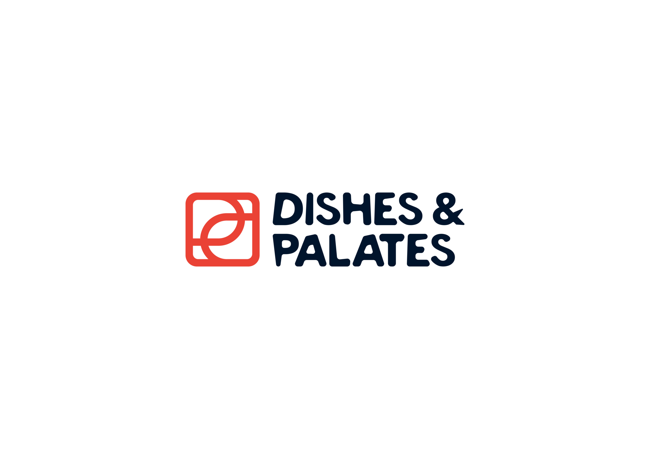
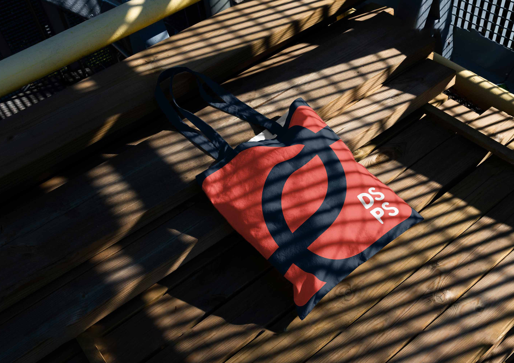
Logo Design
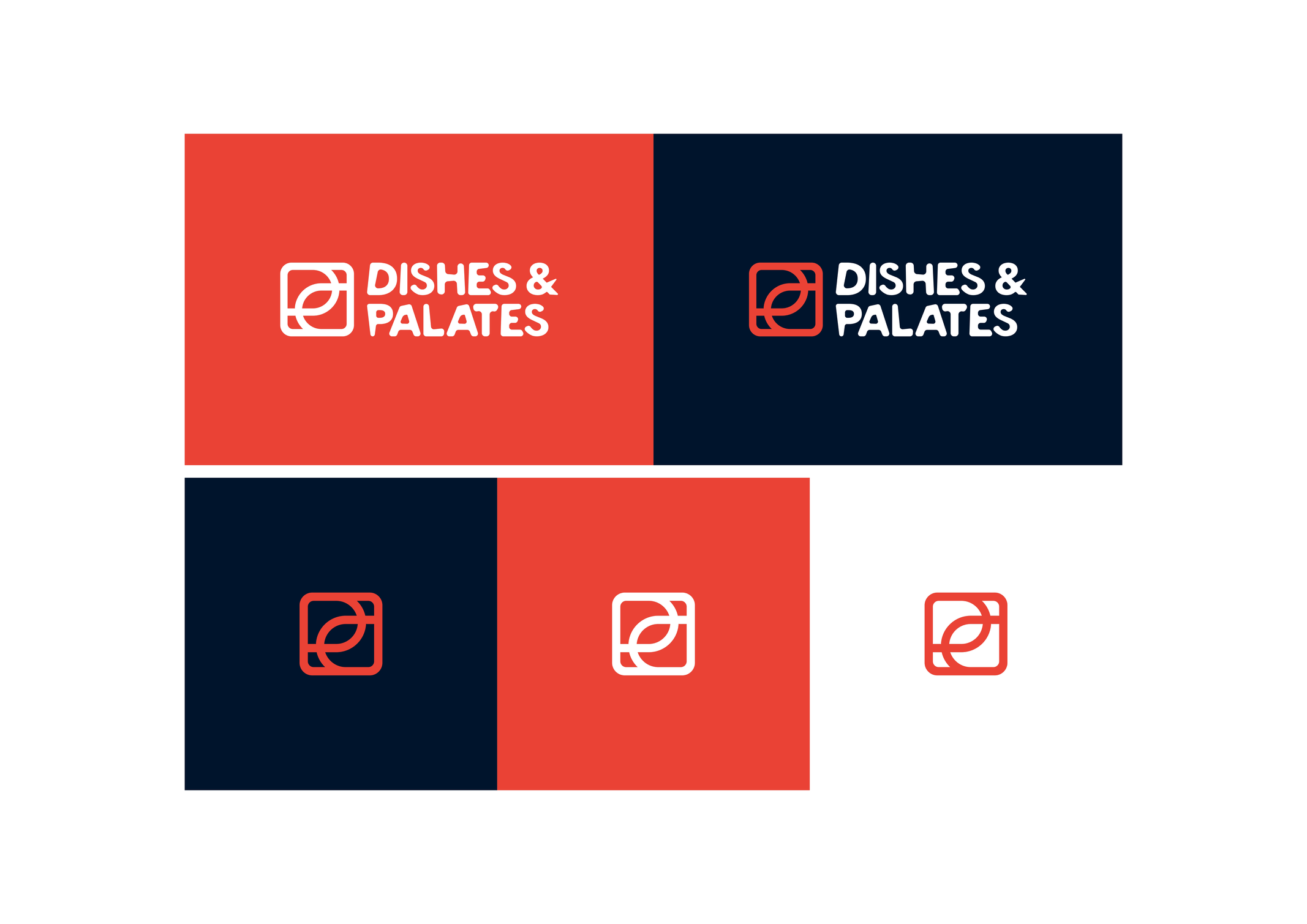
Created a versatile logo system including:
- Primary logo combining logomark and logotype
- Standalone logomark for compact applications
- Standalone logotype for flexible brand usage
- Multiple logo variations for different backgrounds and contexts
Colour Palette
Primary Colours:
- Vibrant Red (#ea4335): Evokes appetite, energy, and passion for food
- Deep Navy (#00162b): Conveys trust, professionalism, and reliability
Primary Colours:
- Warm Orange (#fca111): Adds warmth and approachability
- Purple (#6966f2): Suggests premium quality and creativity
- Fresh Green (#39e587): Represents freshness and health
The color system was designed to work across diverse applications—from app interfaces to packaging to restaurant signage.
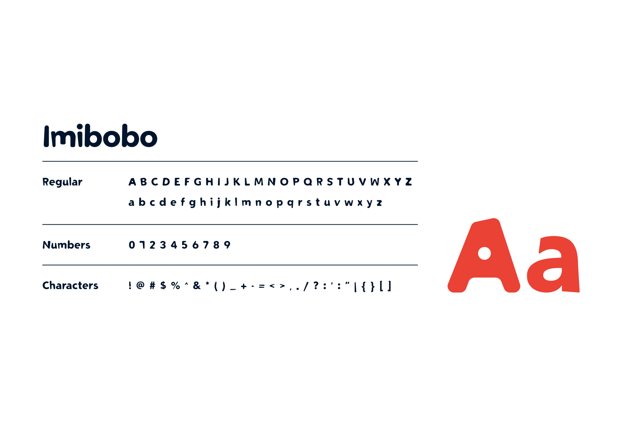
Typography
Primary Typeface: Imibobo
- Used for headlines and brand statements
- Distinctive character that enhances brand recognition
Secondary Typeface: Geologica
- Available in Black, Bold, and Regular weights
- Clean, highly readable for body copy and digital interfaces
- Ensures clarity across all touchpoints
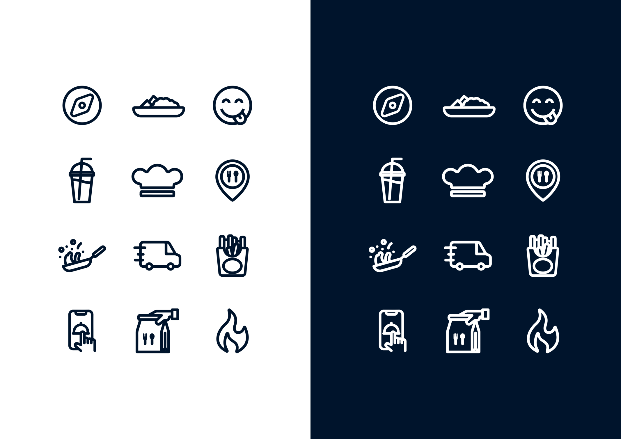
Brand Illustrations
Developed a custom illustration style that:
- Reinforces brand personality through friendly, appetizing visuals
- Can be applied to marketing materials, app interface, and packaging
- Creates consistent visual language across all communications
Brand Guidelines & System
Comprehensive Brand Standards
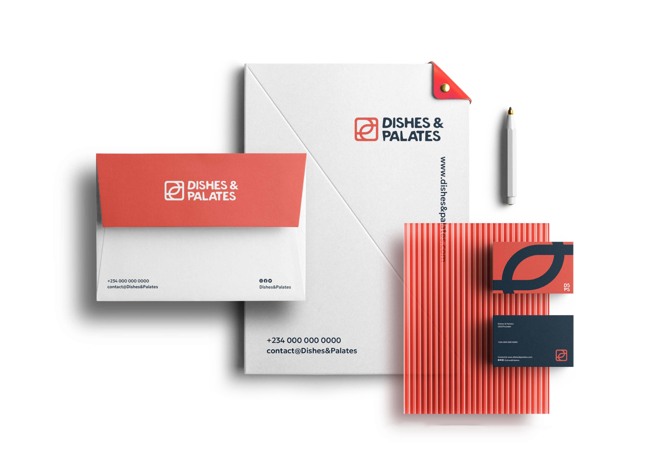
Created detailed brand guidelines covering:
Logo Usage
- Clear space requirements and minimum sizes
- Approved colour variations (full colour, monochrome, reversed)
- Dos and don'ts for logo application
- Guidelines for co-branding scenarios
Visual Applications
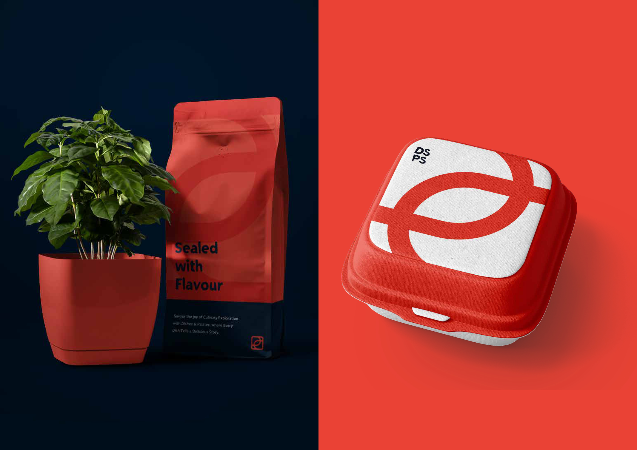
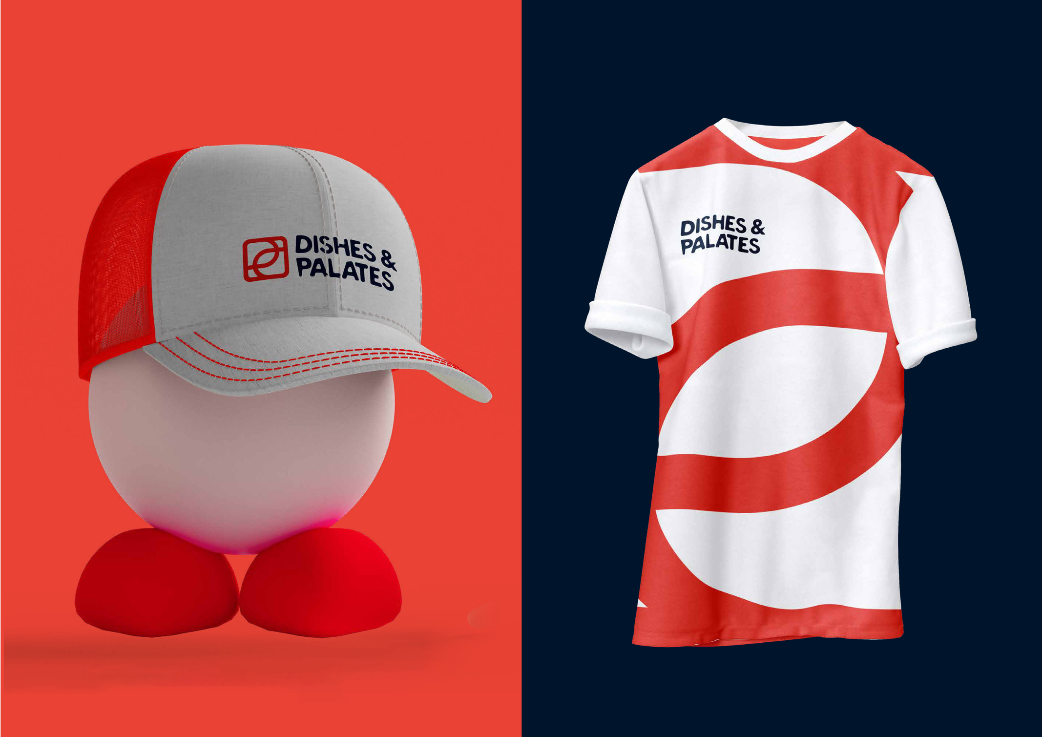
Designed mockups demonstrating brand application across:
- Mobile app interface
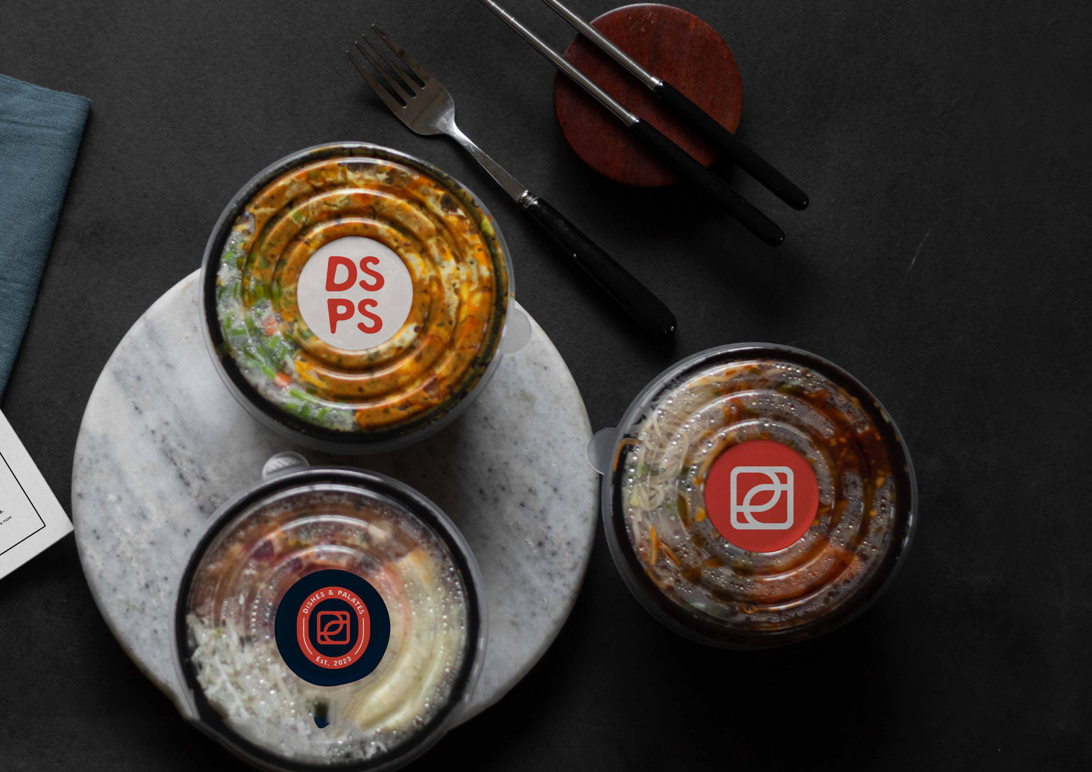
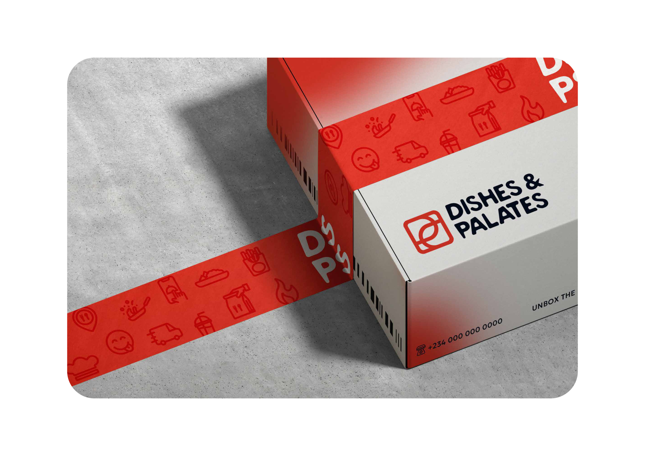
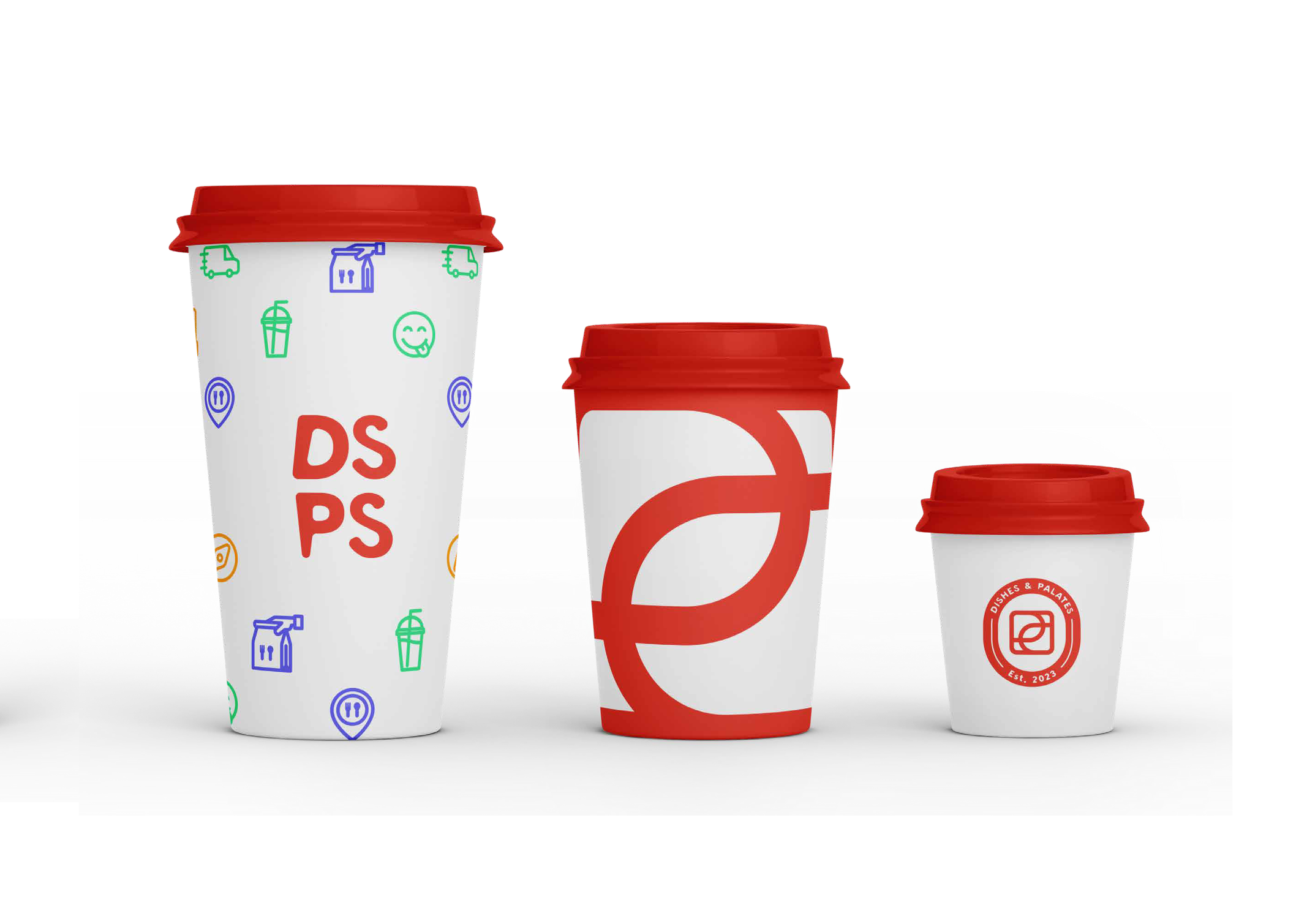
- Food packaging (boxes, bags, containers)
- Restaurant signage and environmental graphics
- Marketing materials (flyers, posters, billboards)
- Delivery fleet branding
- Staff uniforms and merchandise
- Social media templates
- Print advertisements
Consistency Framework
Established standards ensuring:
- Cohesive brand experience across all customer touchpoints
- Easy implementation for franchises and new locations
- Scalability to support nationwide expansion
- Flexibility while maintaining brand integrity
Strategic Brand Touchpoints
Multi-Location Operations
The brand system was specifically designed to:
- Support consistent implementation across multiple restaurant locations
- Enable quick setup of new locations while maintaining brand standards
- Allow for local adaptations without compromising core identity
- Scale efficiently as the business expands nationwide
Digital-First Approach
Given the mobile app-driven nature of the business:
- Ensured brand elements translated effectively to small screens
- Created app-specific brand assets and UI components
- Developed social media brand templates for consistent online presence
- Designed packaging that looked great in delivery photos

Outcome
Deliverables
- Complete brand identity system including logo, colors, typography, and illustrations
- Comprehensive brand guidelines document
- Visual mockups demonstrating brand application across 15+ touchpoints
- Marketing templates and brand assets ready for immediate implementation
- Packaging designs for various meal types and sizes
Impact & Results
Brand Recognition
- Created a distinctive, memorable identity that stands out in the competitive food delivery market
- Established visual consistency across all brand touchpoints supporting multi-location operations
Market Positioning
- Successfully positioned brand as offering premium quality at accessible prices
- Visual system effectively communicates the brand's core values of taste, affordability, and reliability
Operational Efficiency
- Brand guidelines enable consistent implementation across locations without constant creative oversight
- Standardized system reduces design costs and speeds up execution for marketing materials
Foundation for Growth
- Scalable brand system supports the company's nationwide expansion strategy
- Flexible framework allows adaptation to different regions while maintaining brand coherence
Key Learnings
Cultural Relevance Matters
Understanding Nigerian consumer preferences and cultural context was crucial in creating a brand that resonates authentically with the target audience.
System Thinking Drives Consistency
Developing a comprehensive brand system—not just a logo—ensures consistency as the business scales across multiple locations and touchpoints.
Flexibility Within Structure
The brand system needed to be robust enough to maintain consistency yet flexible enough to adapt to diverse applications from digital to physical environments.
Conclusion
Dishes & Palates' brand identity successfully balances premium appeal with accessibility, creating a strong foundation for the company's growth in Nigeria's competitive food delivery market. The comprehensive visual system and brand guidelines ensure consistent implementation across all touchpoints, supporting the brand's mission to deliver tasty, affordable meals with excellent service nationwide.