The Levites Assembly
Overview
The Levites Assembly is a ministry of God-worshippers dedicated to worshiping in Spirit and Truth. This case study outlines the process of creating a brand identity that encapsulates their mission, values, and spiritual calling.
My contribution
Brand Strategy Logo Conceptualization Design Systems
The team
1 × creative director 1 × brand designer 1 x visual designer
Year
2024
Process
Project Overview
The Levites Assembly, a ministry of God-worshippers, sought a cohesive brand identity that encapsulated their mission of worshipping God in Spirit and Truth. The challenge was to create a visual language that resonated with their audience while remaining deeply symbolic of their values and purpose.
Objective: To design a minimal yet impactful identity, with a logomark that reflects the essence of the Levites and their assembly.
Deliverables:
- A custom-designed logomark
- Typography and color palette
- Brand identity guidelines
"The Levites Assembly’s vision was clear: a brand that inspires worship and fosters community."
Understanding the Client’s Vision
The first step was understanding the ministry's foundation. Through discussions, we uncovered the following key elements to represent in the brand identity:
- Spiritual Depth: A focus on worship and connection with God.
- Community & Unity: The gathering of people in worship.
- Simplicity & Elegance: An approachable yet reverent design.
We drew inspiration from the biblical imagery of a tent—a sacred meeting place for worship during the time of the Levites. This concept became the cornerstone of the design process.
The Design Process
a. Concept Development
Sketching began with exploring the visual representation of a "tent" to signify the assembly of worshippers. We aimed for simplicity, elegance, and a structure that could stand as a recognizable emblem.
b. Iterations & Refinement
Through multiple iterations, the final design evolved into a triangular form with open lines. This minimalist structure reflected:
- The sacred tent of worship.
- A directional flow upward, symbolizing divine connection.
- A sense of unity and inclusiveness, inviting worshippers into a shared space.
"Each line and curve of the logo tells a story of reverence, gathering, and sacred purpose."
The Visual Identity
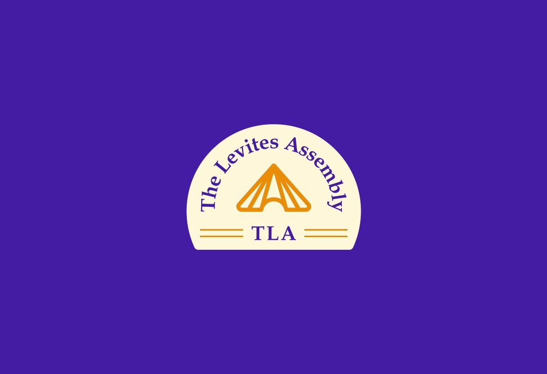
Logomark
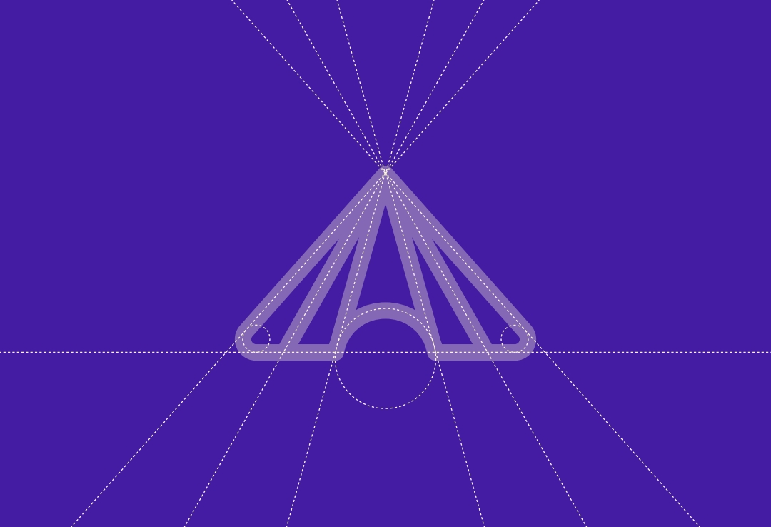
The final logomark is a geometric depiction of a tent, with open-ended lines symbolizing inclusivity and spiritual elevation. The triangular form represents unity, strength, and divinity.
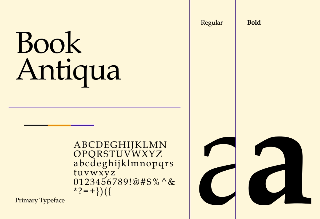
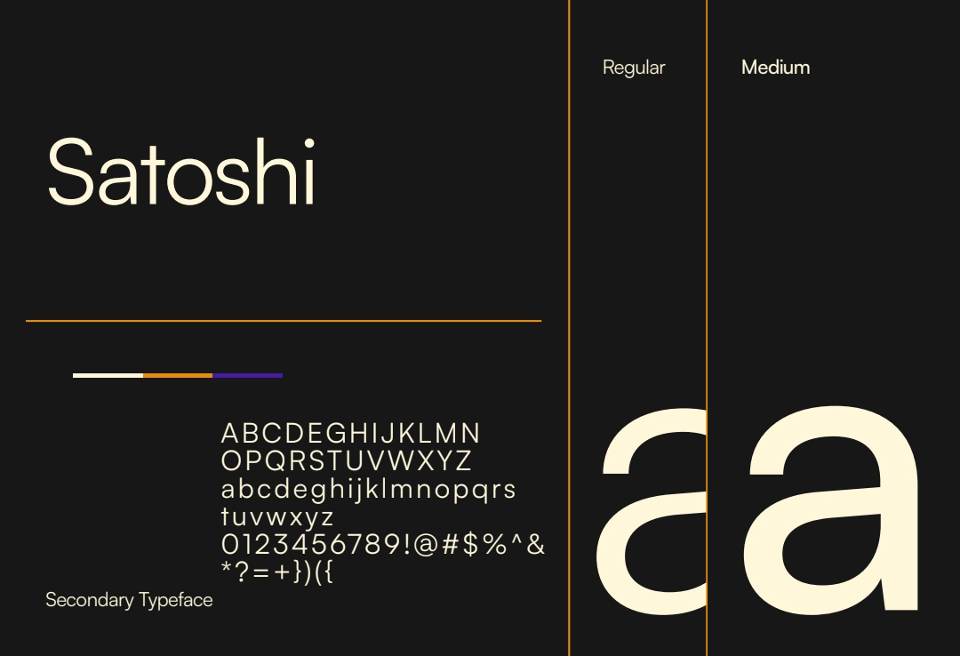
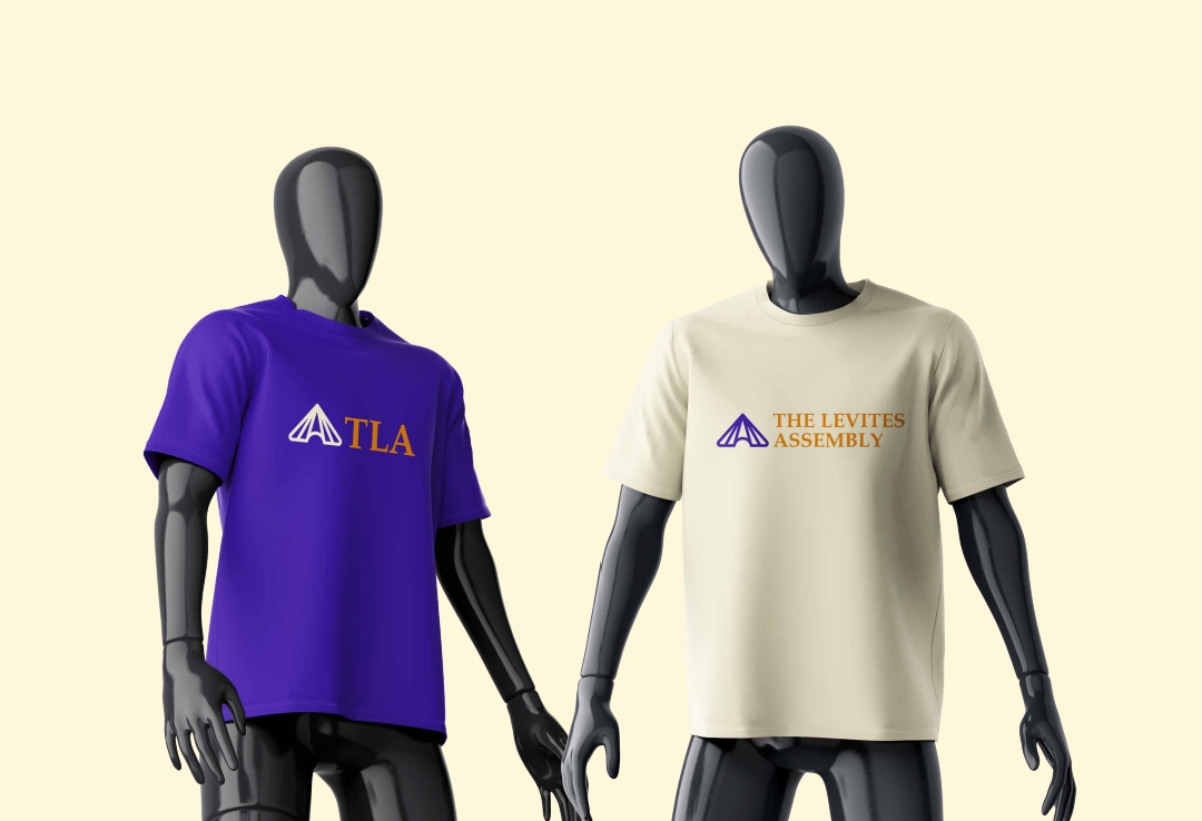
Typography & Color Palette
- Typography: A blend of serif and sans-serif fonts was chosen to strike a balance between tradition and modernity.
- Color Palette:
- Purple: Symbolizing royalty, divinity, and worship.
- Gold: Reflecting holiness and reverence.
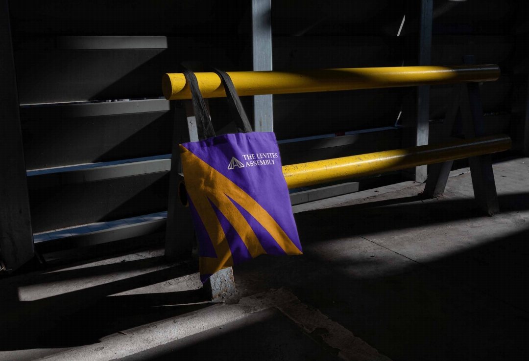
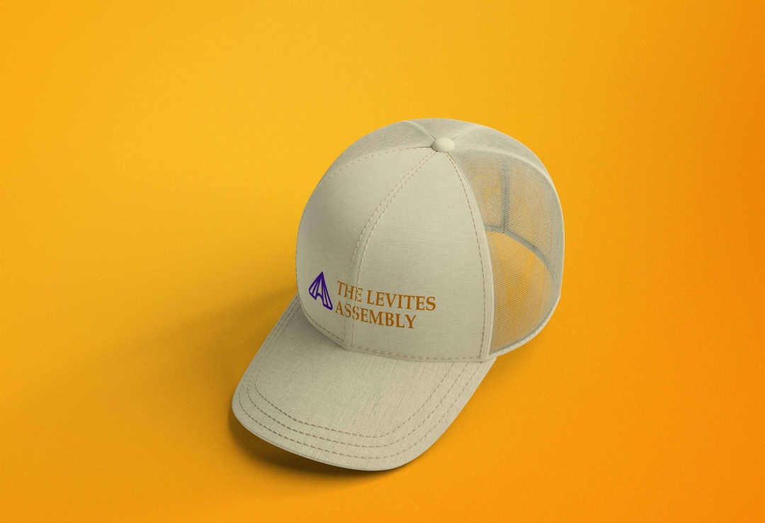
Applications
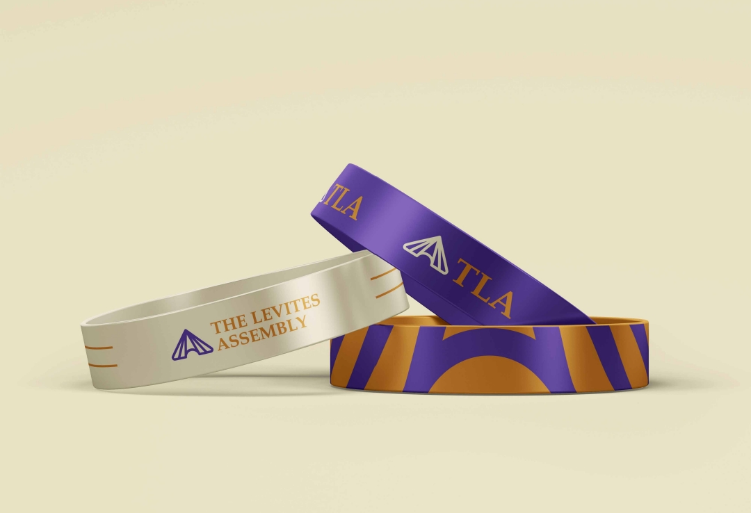
The identity system was crafted for versatility, ensuring its adaptability across print, digital, and physical spaces, including banners, stationery, and social media.
Outcome
A Symbol of Worship and Unity
The completed brand identity embodies the mission and values of The Levites Assembly. The visuals, including the logo and its variations, create a cohesive and memorable experience for their audience.
Logo Highlights:
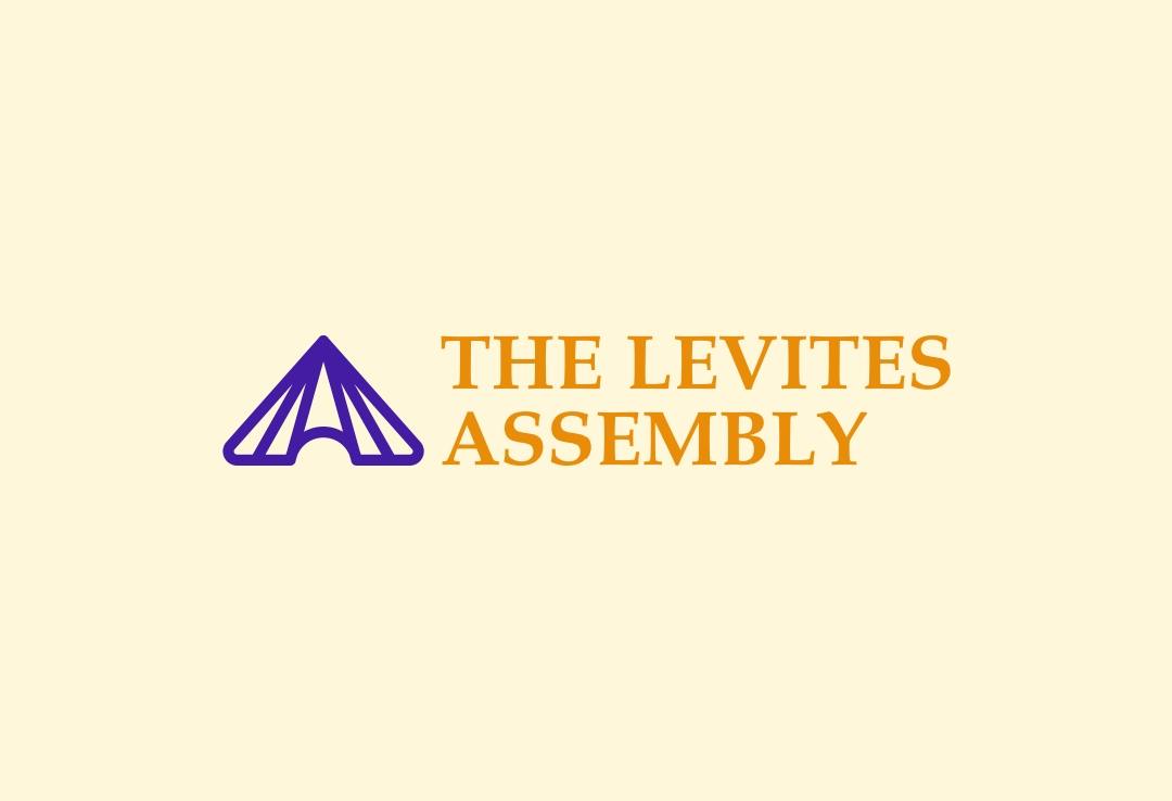
- Primary Logo: Purple and gold color scheme to reflect spiritual royalty and reverence.
- Logomark Construction: Precision-guided geometry for balance and clarity.
- Alternate Backgrounds: Designed to work seamlessly on both light and dark themes.
"The tent is not just a symbol; it’s a reminder of the sacred gathering, encapsulating the essence of The Levites Assembly."
Visual Showcase
Incorporating the uploaded designs:
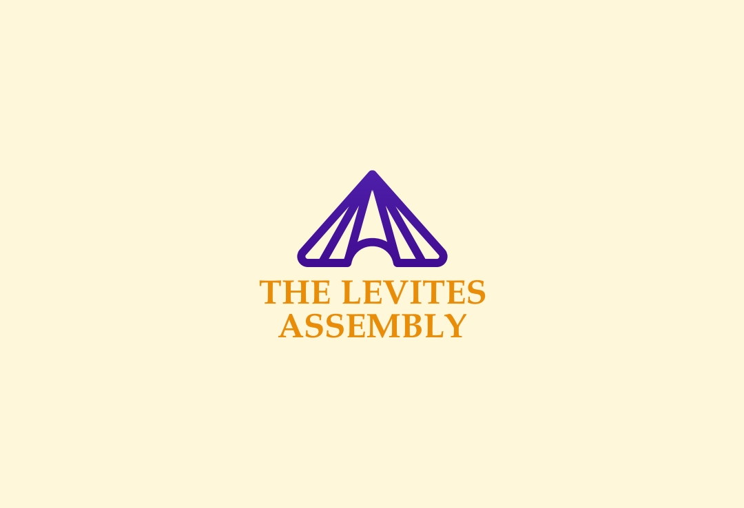
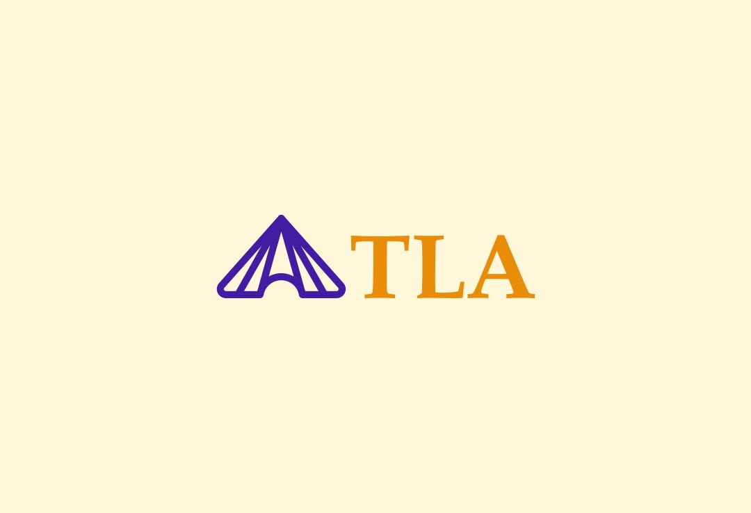
- Logo Design Variants: Primary and secondary options tailored for different use cases.
- Construction Grid: Highlighting the geometry and proportional balance.
- Application Previews: Demonstrating how the brand identity thrives in real-world contexts, from worship materials to digital media.
Conclusion
The branding project for The Levites Assembly represents the intersection of spiritual purpose and thoughtful design. By creating a visual identity deeply rooted in meaning, the ministry now has a brand that not only resonates with its members but also stands as a symbol of its mission to worship God in Spirit and Truth.
"This project is a testament to the power of meaningful design—when visuals align with purpose, the impact is profound."